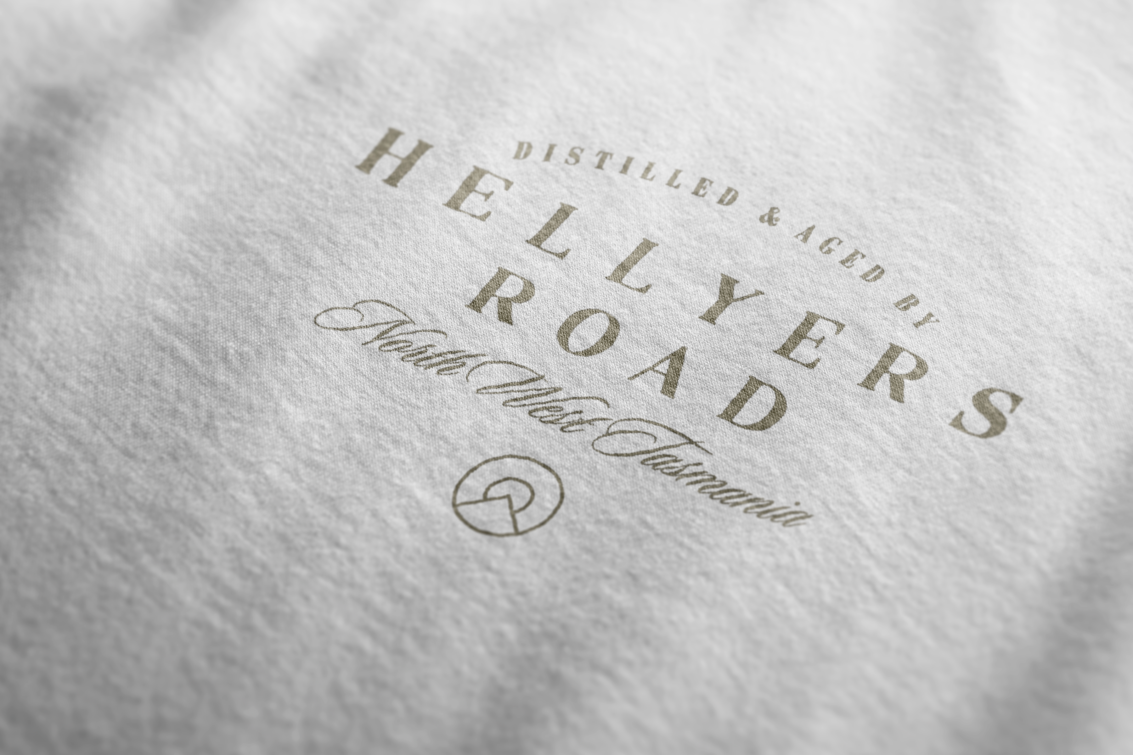
Hellyers Road Whisky Logo & Brand Identity
We developed a new brand identity for Hellyers Road. Globally awarded artisan single malt whisky company, from the remote north-west Tasmania, Australia.
Capturing the unique heritage and spirit of the brand, which was adapted across communication, packaging, website, instore, social, stationary and experiential.
Founded in 1999 by a group of dairy farmer families from Burnie in Tasmania, whose bold belief that the wild and remote North-West Tasmania was the perfect environment to create globally award winning whisky, Hellyers Road began unconventionally - and this restless spirit still lives on today.
The whisky distillery takes its name from the spirit of its location and origins. A physical ‘Hellyers Road’ once ran right through the middle of where the distillery now sits. A road surveyed in 1820 by one of the first Europeans to boldly explore and survey the rugged, remote North-West Tasmania - surveyor, cartographer & explorer, Henry Hellyer.
![]()
Capturing the unique heritage and spirit of the brand, which was adapted across communication, packaging, website, instore, social, stationary and experiential.
Founded in 1999 by a group of dairy farmer families from Burnie in Tasmania, whose bold belief that the wild and remote North-West Tasmania was the perfect environment to create globally award winning whisky, Hellyers Road began unconventionally - and this restless spirit still lives on today.
The whisky distillery takes its name from the spirit of its location and origins. A physical ‘Hellyers Road’ once ran right through the middle of where the distillery now sits. A road surveyed in 1820 by one of the first Europeans to boldly explore and survey the rugged, remote North-West Tasmania - surveyor, cartographer & explorer, Henry Hellyer.


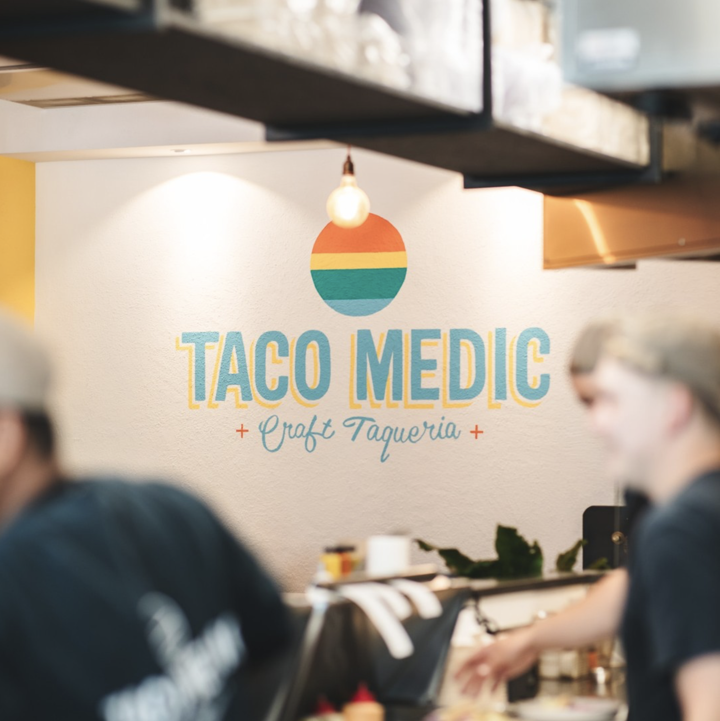
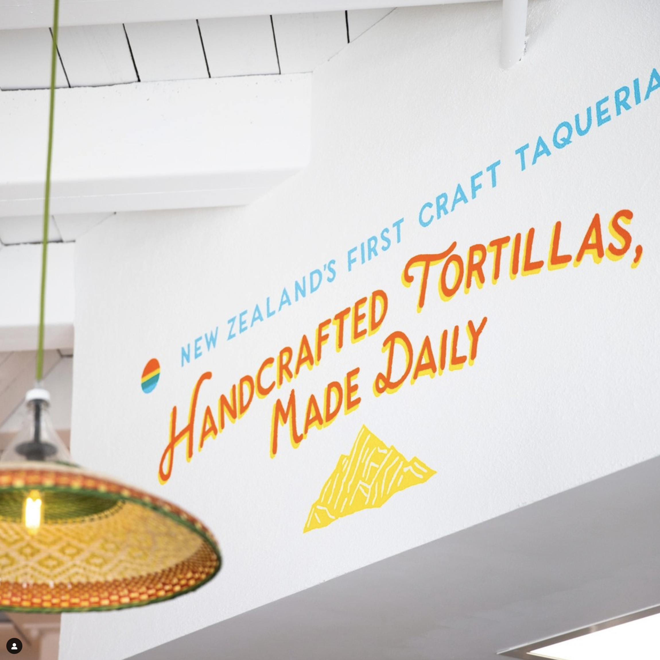
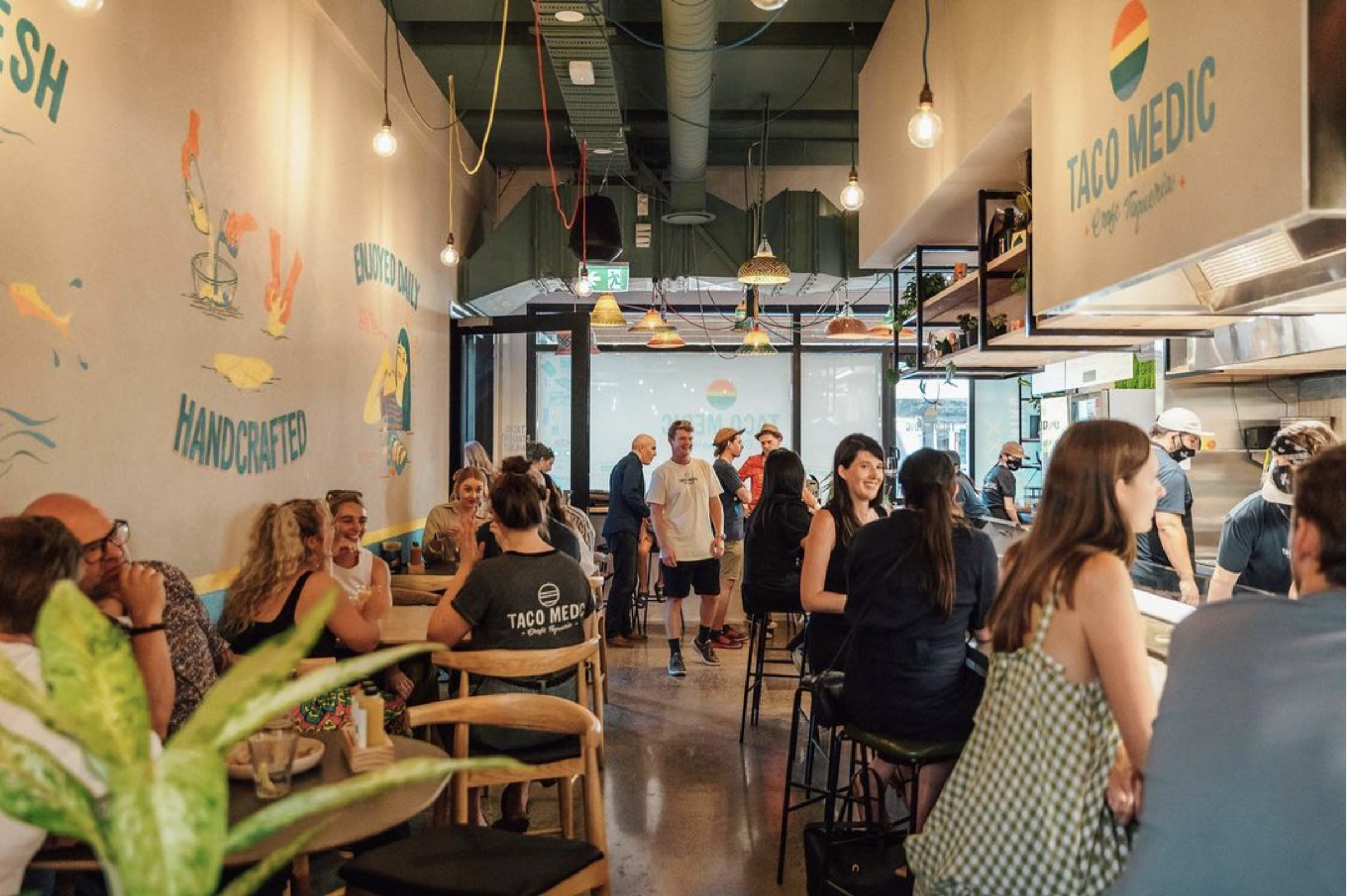
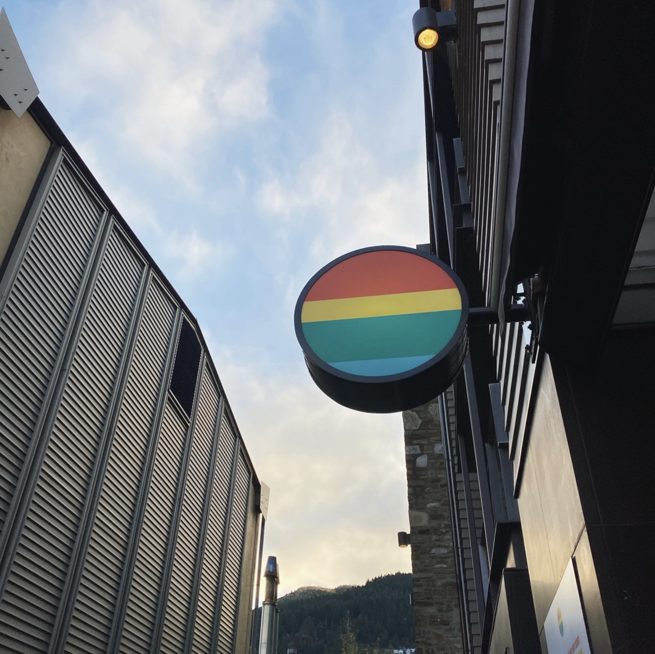
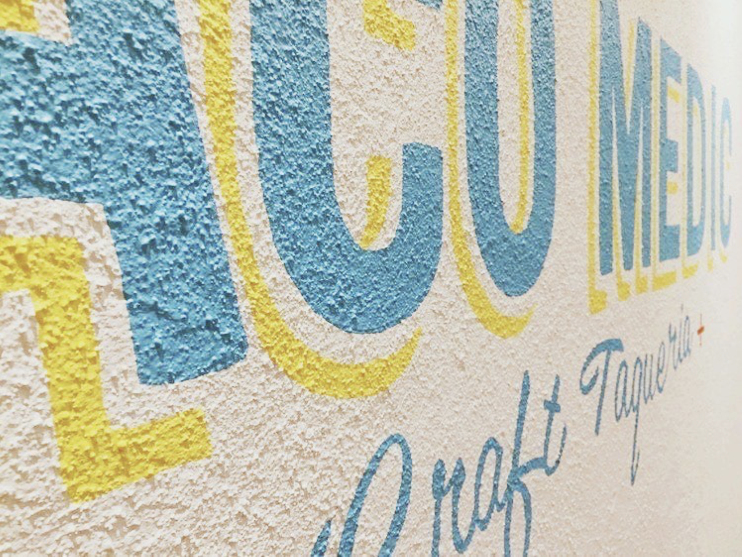
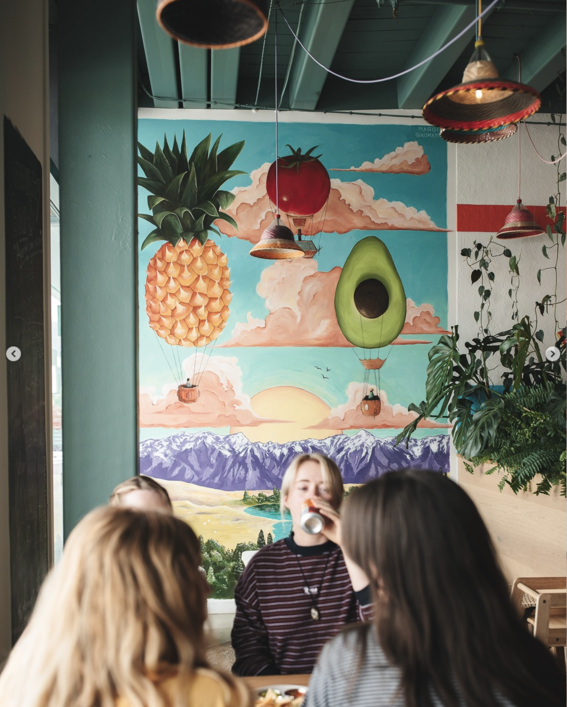
Taco Medic
Logo & Brand Identity
We created brand identity & logo design for sustainable fast food company Taco Medic.
Which was adapted into signage, store design, menus, social, website, communications, uniforms and merchandise.


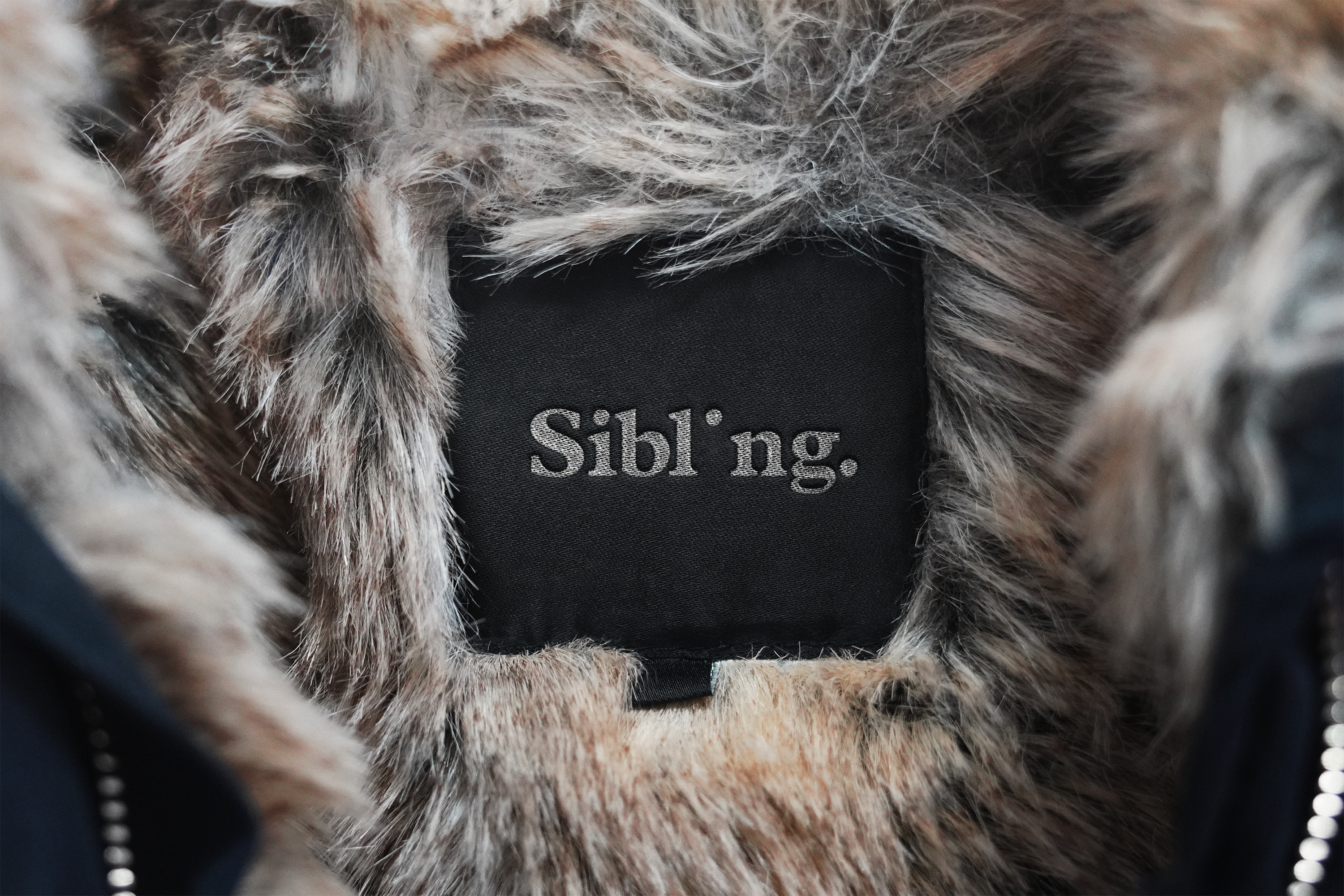
Sibling
Logo & Brand Identity
We created brand identity & logo design for purpose built retail fashion communication & media company Sibling.
Which was adapted into communication, signage, office design, social, website & presentation material.


Hellyers Road Whisky Website Design
We developed a new website (in Shopify) for Hellyers Road. Globally awarded artisan single malt whisky company, from the remote north-west Tasmania, Australia.
Capturing the unique heritage and spirit of the brand, which was also adapted across logo design, identity communications, packaging, instore, social, stationary and experiential.
Founded in 1999 by a group of dairy farmer families from Burnie in Tasmania, whose bold belief that the wild and remote North-West Tasmania was the perfect environment to create globally award winning whisky, Hellyers Road began unconventionally - and this restless spirit still lives on today.
The whisky distillery takes its name from the spirit of its location and origins. A physical ‘Hellyers Road’ once ran right through the middle of where the distillery now sits. A road surveyed in 1820 by one of the first Europeans to boldly explore and survey the rugged, remote North-West Tasmania - surveyor, cartographer & explorer, Henry Hellyer.
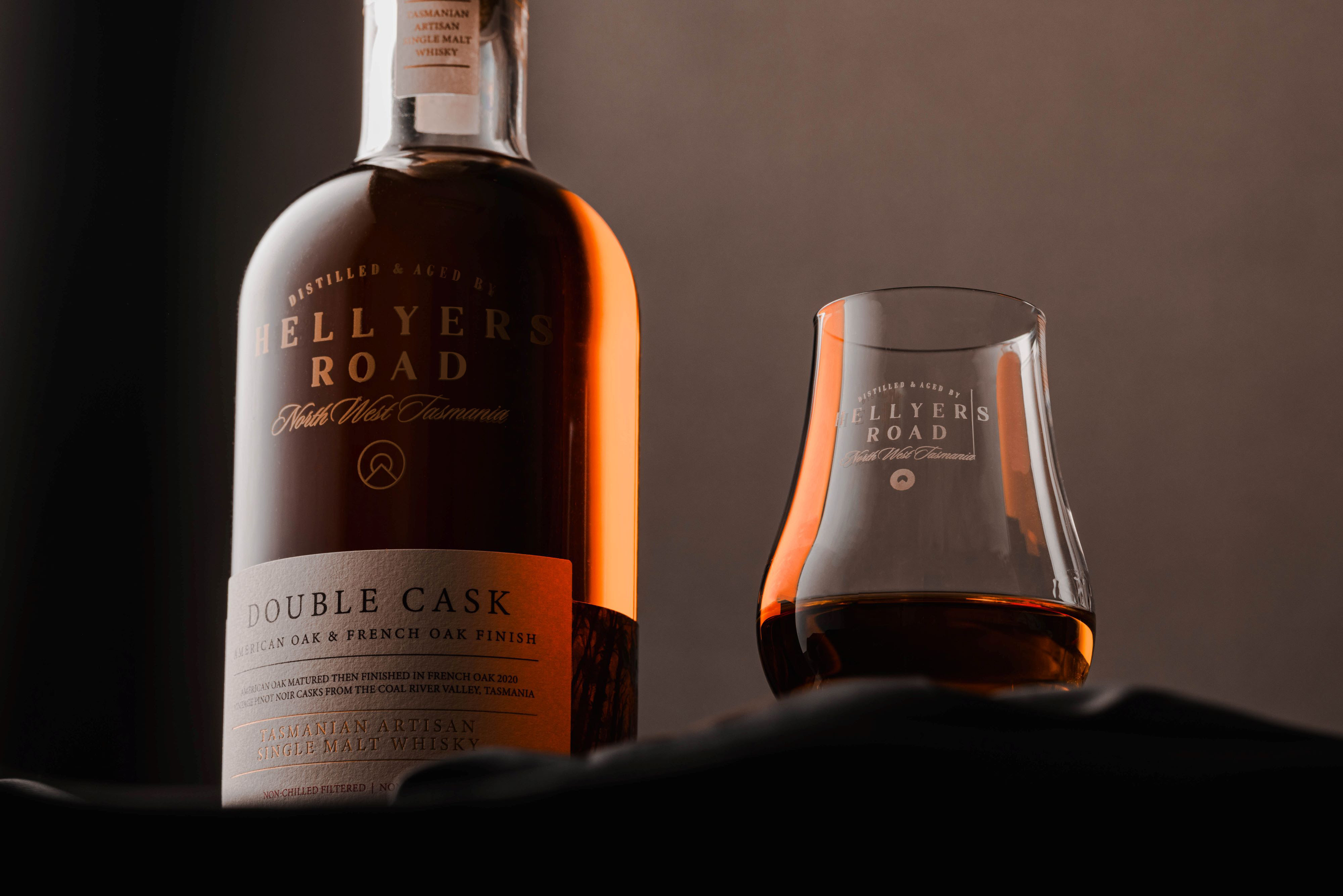
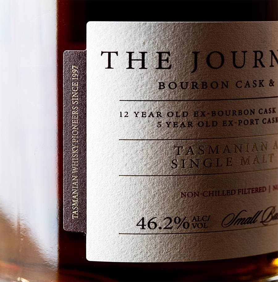
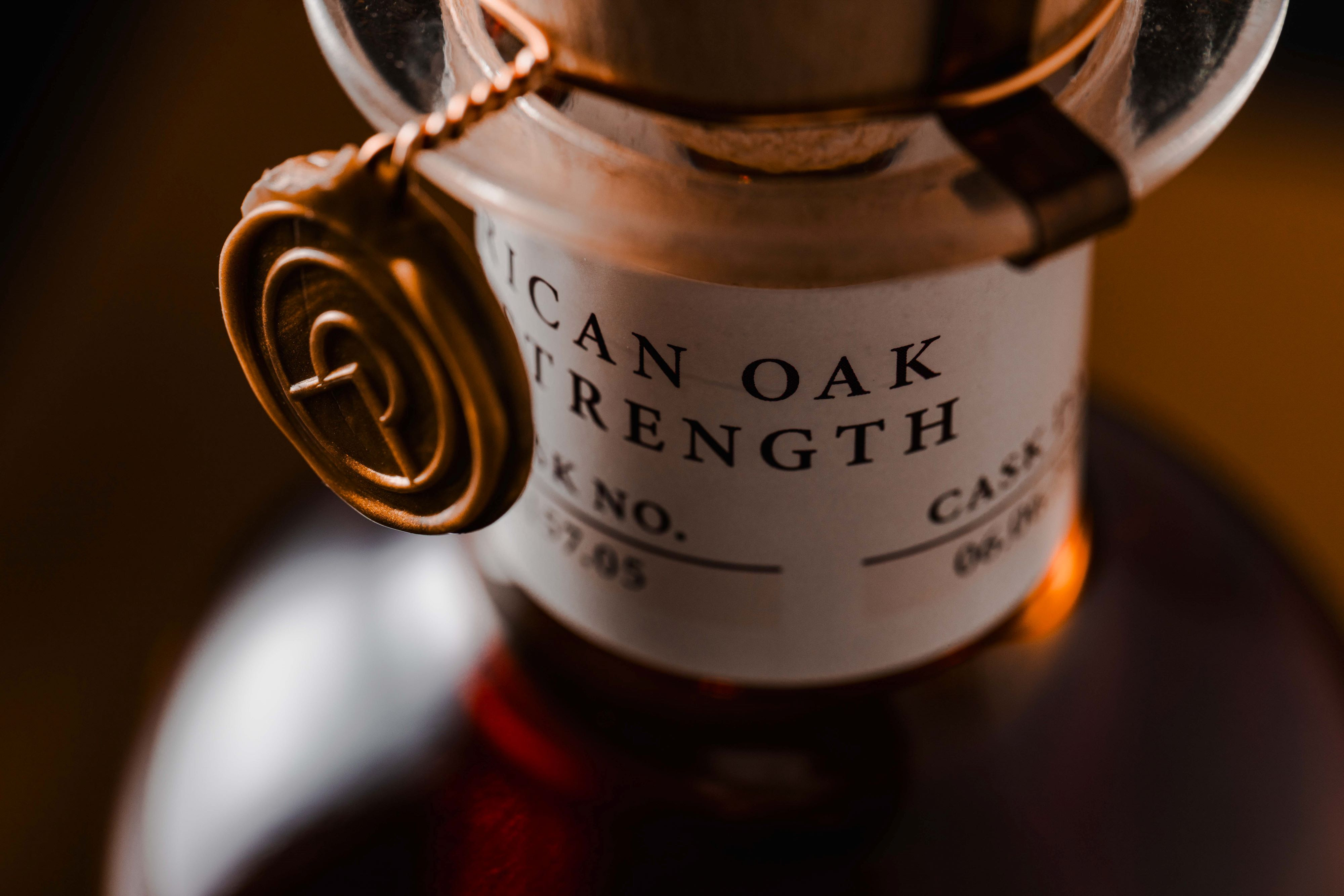
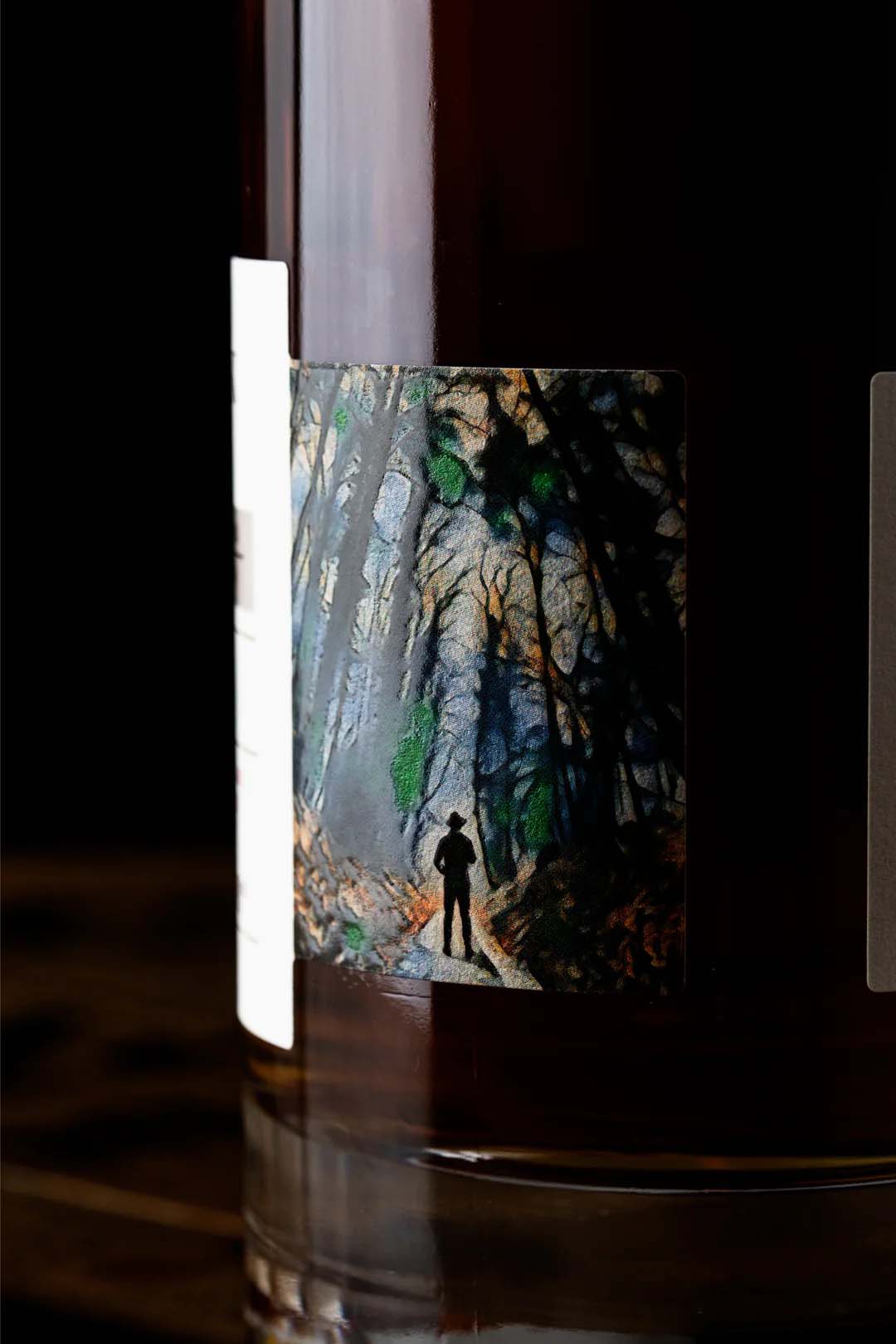
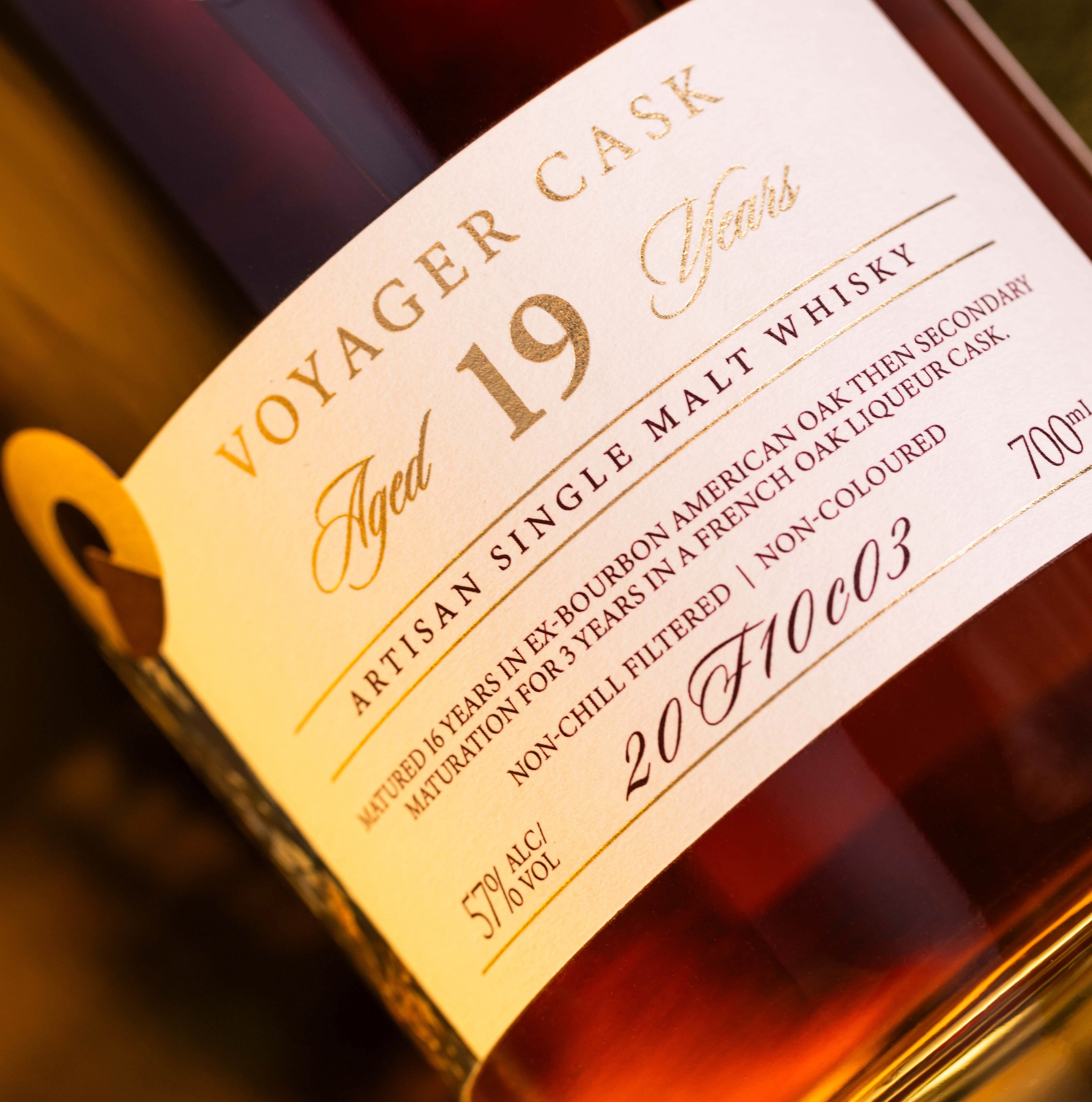
Hellyers Road Whisky Packaging Design
We developed a new packaging design for the complete product porfolio for Hellyers Road. Globally awarded artisan single malt whisky company, from the remote north-west Tasmania, Australia.
Capturing the unique heritage and spirit of the brand, which was also adapted across logo design, identity communications, packaging, instore, social, stationary and experiential.
Founded in 1999 by a group of dairy farmer families from Burnie in Tasmania, whose bold belief that the wild and remote North-West Tasmania was the perfect environment to create globally award winning whisky, Hellyers Road began unconventionally - and this restless spirit still lives on today.
The whisky distillery takes its name from the spirit of its location and origins. A physical ‘Hellyers Road’ once ran right through the middle of where the distillery now sits. A road surveyed in 1820 by one of the first Europeans to boldly explore and survey the rugged, remote North-West Tasmania - surveyor, cartographer & explorer, Henry Hellyer.


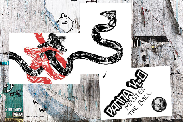
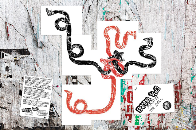
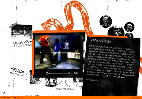
Nike
‘Panna Knockout’.
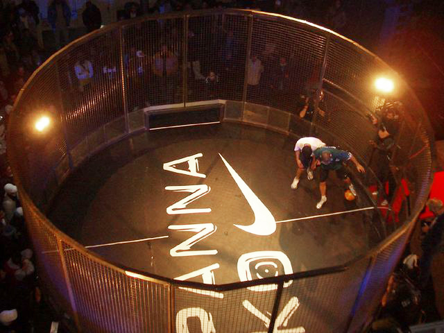
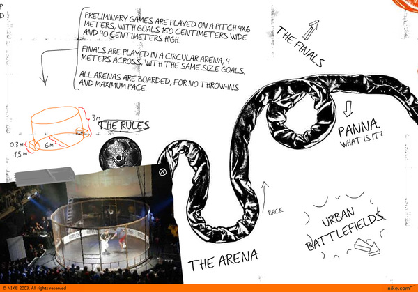
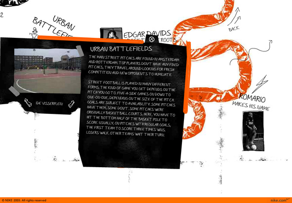
Amsterdam has a reputation in street football. In 2003 we created the ‘Panna K.O.’ tournament. This is a one on one knockout game played in a small arena or cage. First one to make a tunnel on the other player or score 3 goals, wins the game. With what started in Amsterdam, went global.
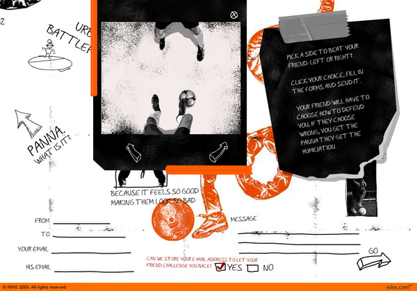
The idea was universal for football kids the world over and became a feature on nikefootball.com. The design was a playful big board, full of animations and videos. The platform created by LBi Copenhagen, was one of the first interactive & user generated digital platforms in the world & won Cannes Lions Cyber Grand Prix.
The idea was universal for football kids the world over and became a feature on nikefootball.com. The design was a playful big board, full of animations and videos. The platform created by LBi Copenhagen, was one of the first interactive & user generated digital platforms in the world & won Cannes Lions Cyber Grand Prix.

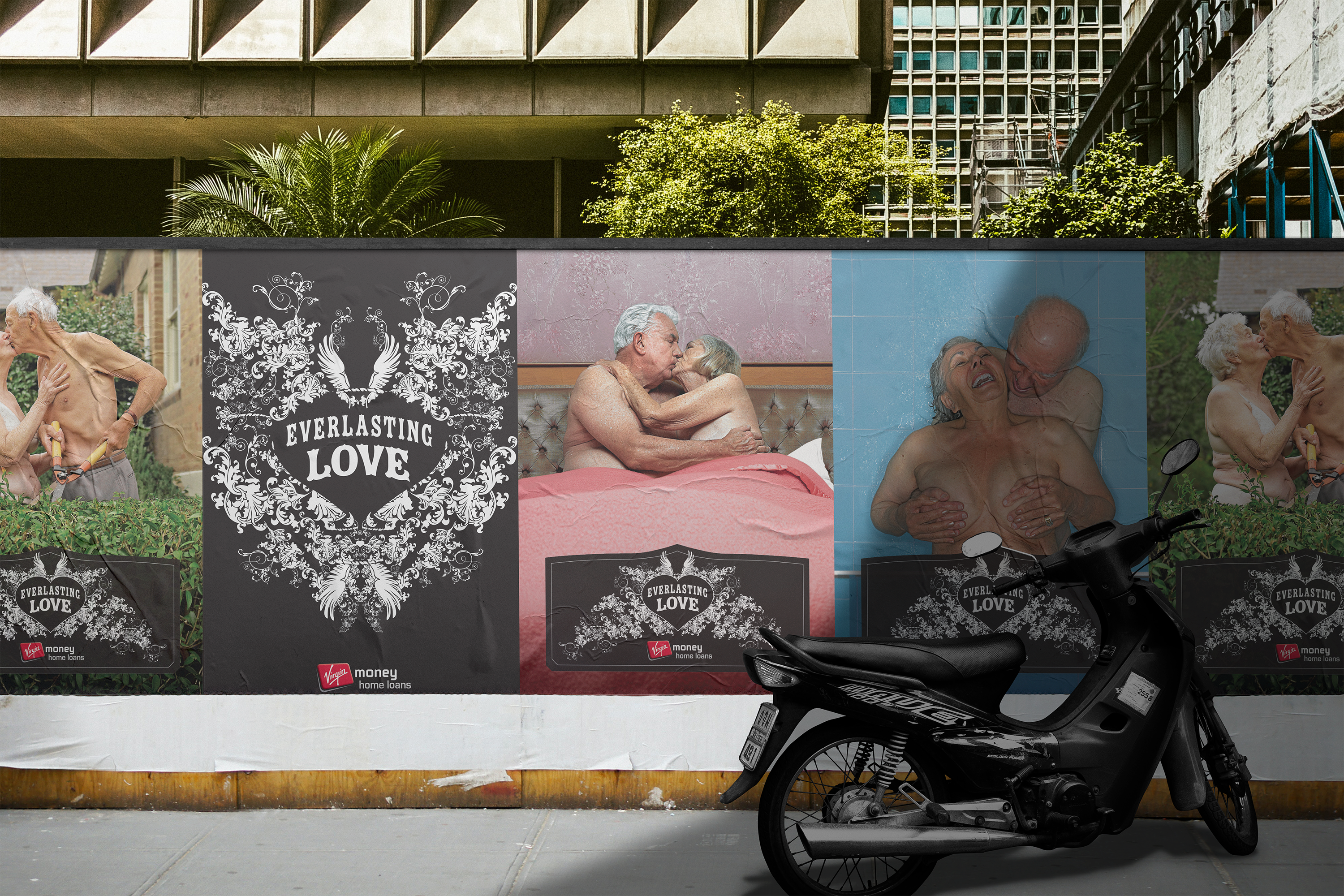
Virgin ‘Everlasting Love’
Two years into your home loan, your lender has covered all their costs and your repayments become (for them) pretty much pure profit?
The brief was to help cut down this period and allow Virgin Money to enjoy more of this ‘profit period’.
The product we developed in collaboration with Virgin was a loan where your interest is reduced the longer you have it.
The idea was expressed in communications as Everlasting Love.
The campaign was launched with a Guinness World Record: 278 couples renewing their wedding vows in Sydney’s Centennial Park. And used a series of these couples (who’d been together for decades) as the heroes of a TV and print campaign.


Case Study

ADMA Gold
ADMA Bronze
Award Award Finalist
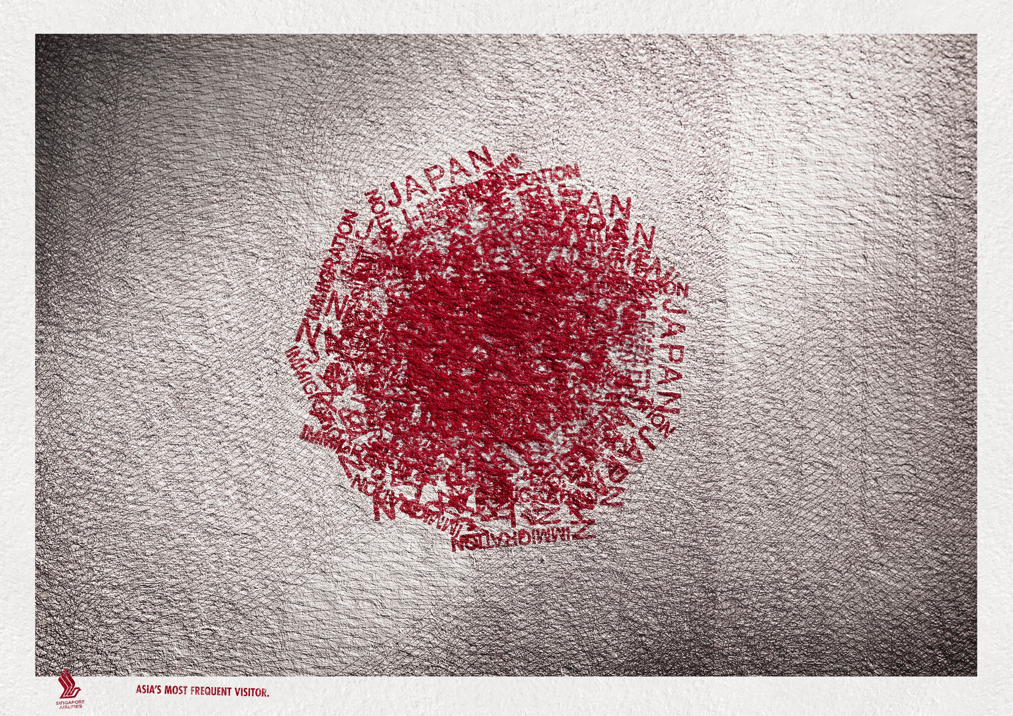
Singapore Airlines
‘Asia most frequent visitor’

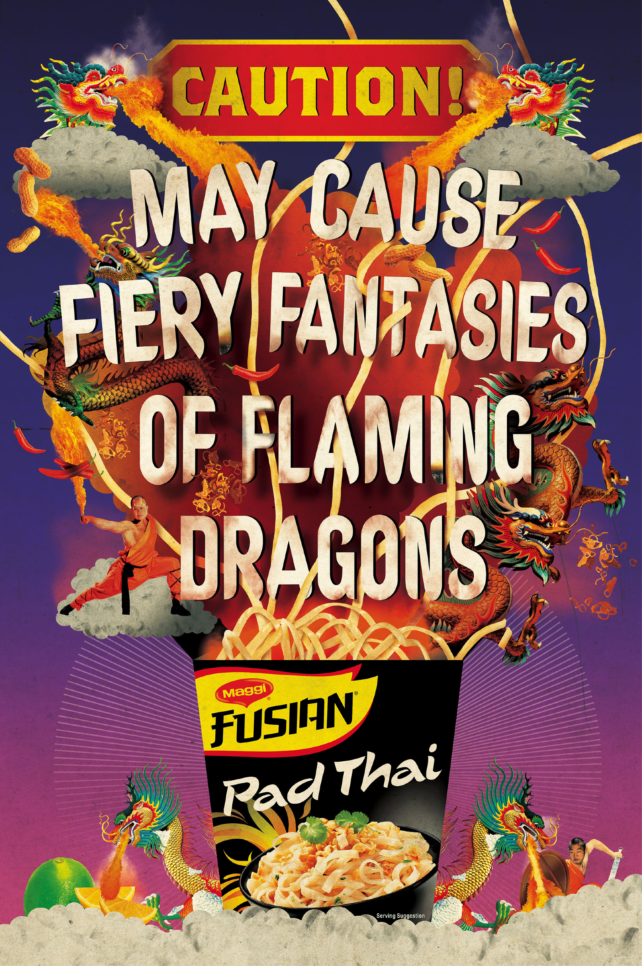
Maggi Fusion ‘Caution’


The making of...
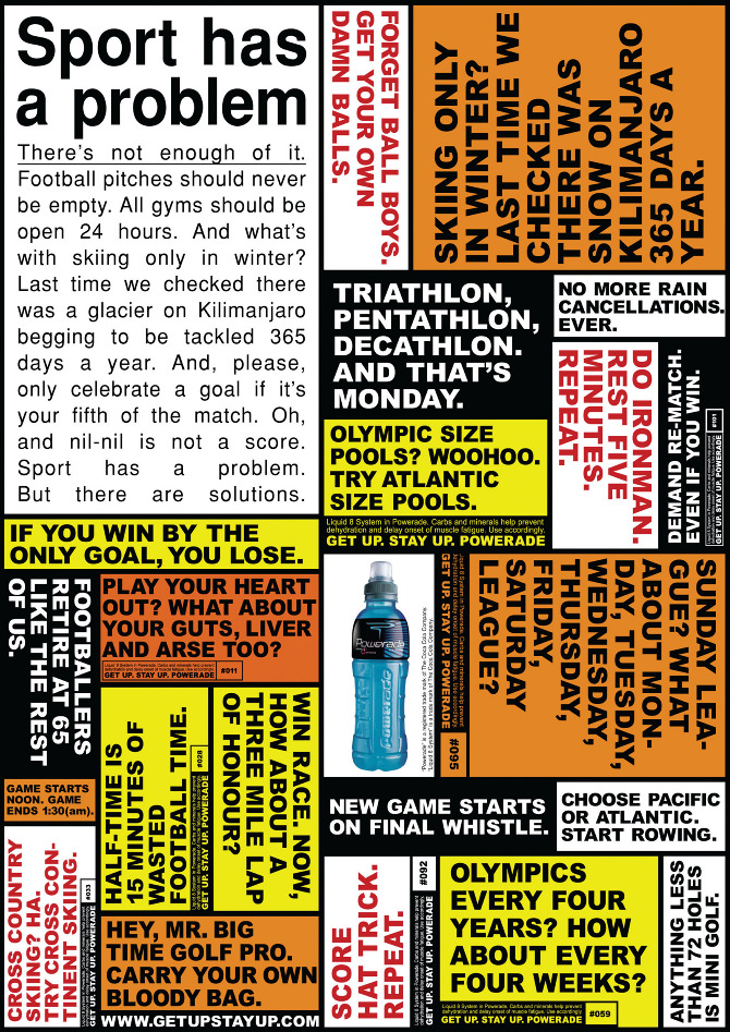
Powerade ‘Fuel your obsession’
Character Development


Outdoor/Installation


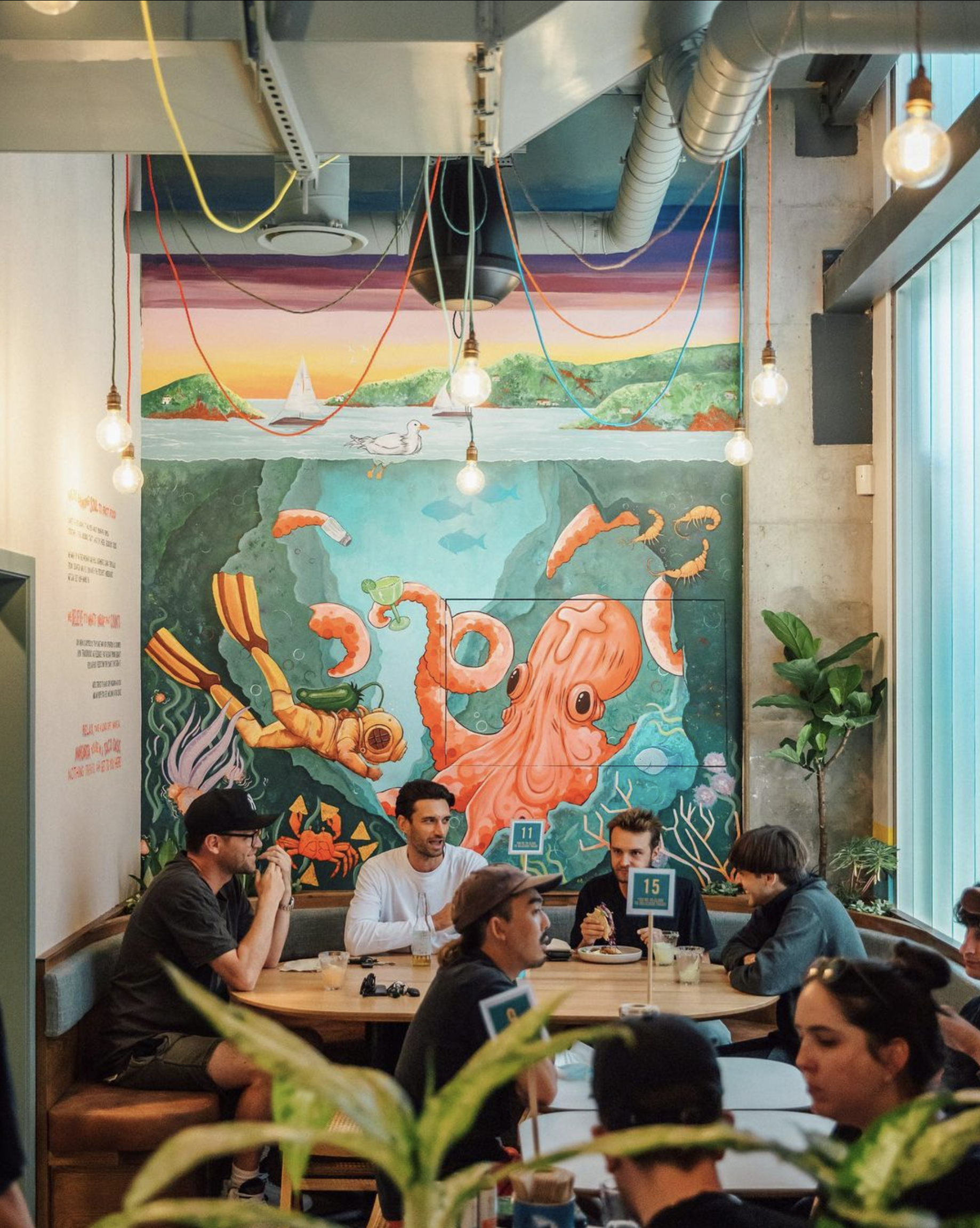
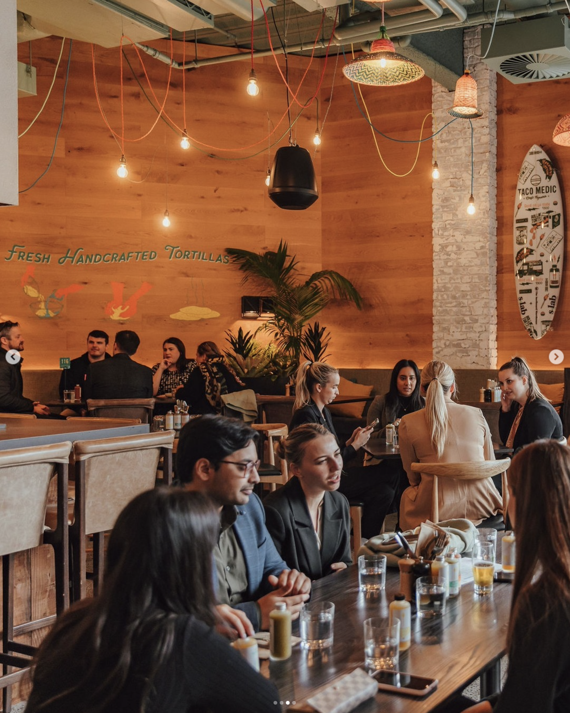
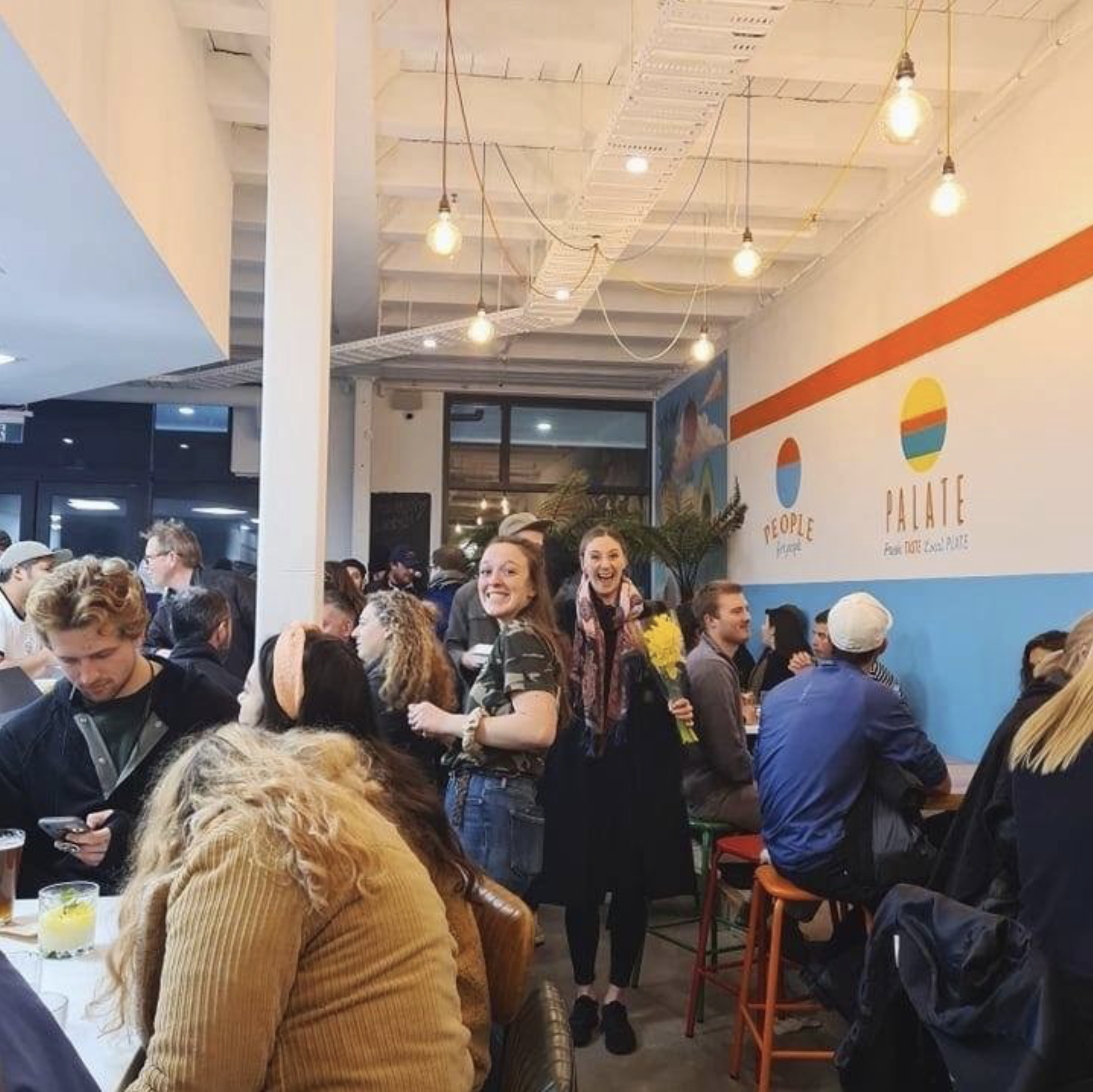
Taco Medic
Store Design
We created store design for sustainable fast food company Taco Medic.